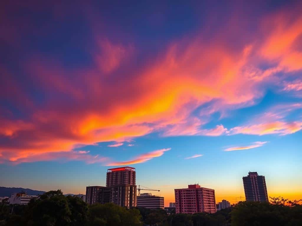

Did you know that using color contrast in photography can make your images 50% more appealing? It’s true! By understanding color theory, photographers can create vibrant shots that grab attention. When I focus on color contrast, I highlight differences in hues and tones.
This turns ordinary images into amazing visual experiences. By using bold color combinations, I not only make my photos look better but also guide the viewer’s eye. In this article, I’ll explore the basics and techniques of color contrast in photography. It will help you improve your creative editing skills.
Key Takeaways
- Color contrast can be categorized into tonal contrast and color contrast.
- Complementary colors, directly opposite on the color wheel, produce the strongest visual impact.
- Introducing contrasting colors can highlight main objects or critical details in an image.
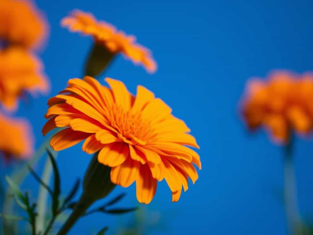
- Natural color contrasts are readily available in nature, from flowers to birds.
- Using a splash of an opposite color can dramatically enhance a monochromatic palette.
- Simplifying compositions helps to maintain focus on contrast, achieving a striking visual effect.
Understanding the Basics of Color Contrast in Photography
Color contrast is key in photography. It affects how well subjects stand out and how we feel when we see them. Knowing about tonal contrast helps make photos that grab our attention.
Defining Contrast
In photography, contrast is about the difference in light and color between parts of an image. Tonal contrast shows this difference clearly, making subjects stand out in black, white, and gray. This basic understanding helps us see how light and shadow work together to create powerful images.
The Importance of Contrast in Photography
High contrast images have lots of different tones, making textures and visuals pop. They often have dark shadows next to bright spots, making the image more lively. On the other hand, low contrast photos blend light and dark, creating softer scenes. This is great for dreamy landscapes or close-up portraits.
How Contrast Influences Mood and Emotion
Contrast doesn’t just make images look good; it also shapes the mood. Warm colors with high contrast feel cozy and happy. Cool colors in low contrast photos can be calming. By using these techniques, I can tell stories that touch people’s hearts. Using silhouettes or HDR can make contrast even more powerful in my photos.
Mastering Color Contrast in Photography
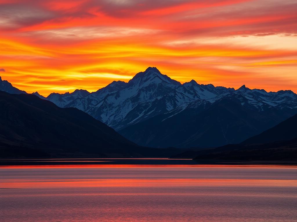
Effective color contrast can make a photo stand out. By using complementary colors like red and green, or blue and orange, I create eye-catching visuals. These colors, opposite each other on the color wheel, add depth and emotion to an image.
Complementary Colors and Their Impact
Complementary colors add vibrancy to photos. They make each other look more intense and stir strong feelings. This method helps me highlight the main subject and adds depth to the background.
The Role of Color Temperature
The color temperature in my photos sets the mood. Warm colors, like reds and oranges, feel cozy and intimate. Cool colors, like blues and greens, bring calmness. Changing the color temperature changes how the photo feels.
Using the Color Wheel for Striking Combinations
The color wheel helps me find harmonious colors. By trying out different schemes, I balance my photos and keep them interesting. This practice sharpens my color contrast skills and helps me convey emotions through my photos.
Advanced Techniques for Enhancing Color Contrast
In photography, learning advanced color contrast techniques can really make your images pop. Understanding high key and low key lighting is key. These methods change how light interacts with subjects, creating amazing effects.
High Key and Low Key Lighting Effects
High key lighting makes images bright and even, focusing on the light areas. It brings out happiness and positivity, perfect for portraits or products. Low key lighting, on the other hand, creates a dark mood with deep shadows. It’s great for adding drama and tension.
By using high key or low key lighting, I can tell stories with my photos.
Utilizing Silhouettes and Backlighting
Silhouette photography adds depth to images by placing subjects against a bright background. It creates high-contrast visuals that grab attention. Backlighting also boosts color contrast and adds depth.
Playing with shadows and light can transform a photo. It adds layers of meaning and emotion.
Exploring HDR Photography for Depth
HDR photography combines multiple exposures for a wider range of tones and details. It increases color contrast, adding depth to images. Using HDR lets me explore light and dark, improving my photos’ overall look.
Conclusion
Mastering color contrast in photography is key to making my portfolio stand out. It lets me create images that grab attention. By understanding contrast, I can make my photos vibrant and engaging.
Exploring different lighting styles, like high-key and low-key, helps set the mood of my photos. Knowing how to use contrast, even in small details, makes my images more interesting. This skill also helps me avoid over-editing, keeping my photos true to life.
Practicing and trying new things with color and contrast helps me capture my subjects’ true essence. I aim to make photos that not only catch the eye but also tell a story. This way, my photos can truly connect with people.
